Penthouse Museum Tower – New York
Location: New York
Slide Tortora
Collection: Natural Genius
Architects: Asdrubal Franco and Andres Azpurua (Domoarchitecture + Onsite)
Year: 2015
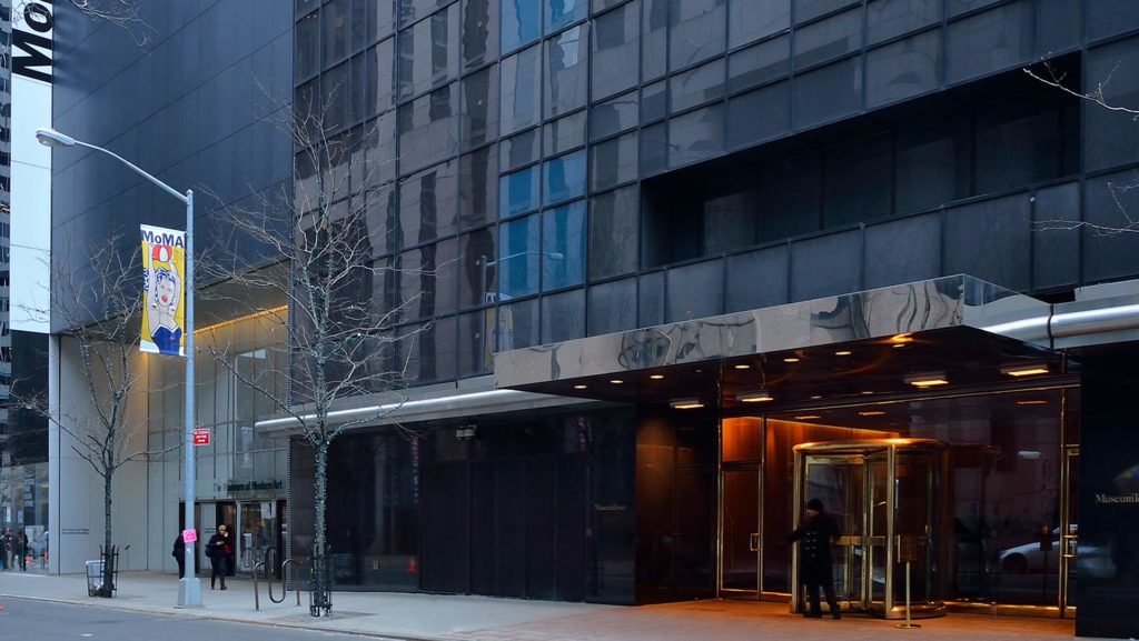
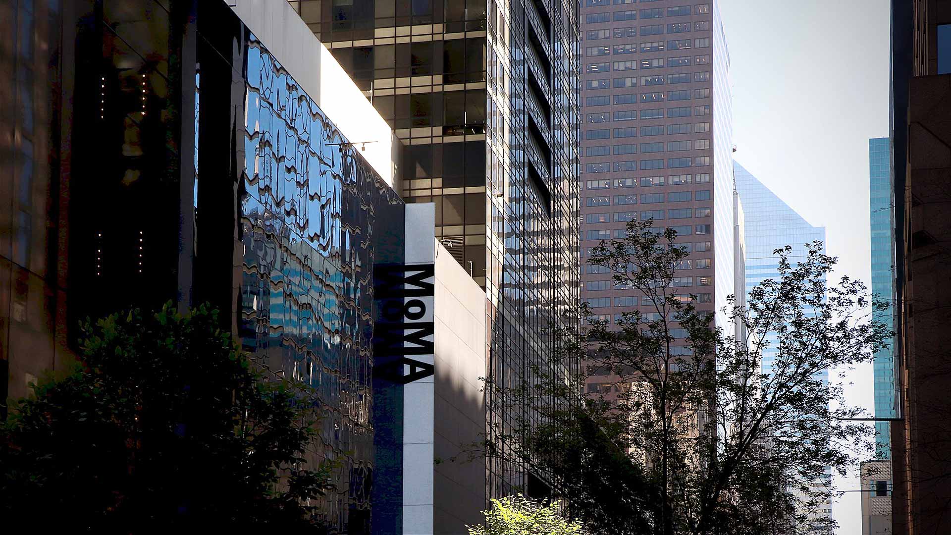
Located in the heart of Midtown Manhattan, the Museum Tower was built as part of an extension of MoMA. This project was for the 50th anniversary of the museum’s foundation and it involved doubling the exhibition space and creating an auditorium, two restaurants and a library.
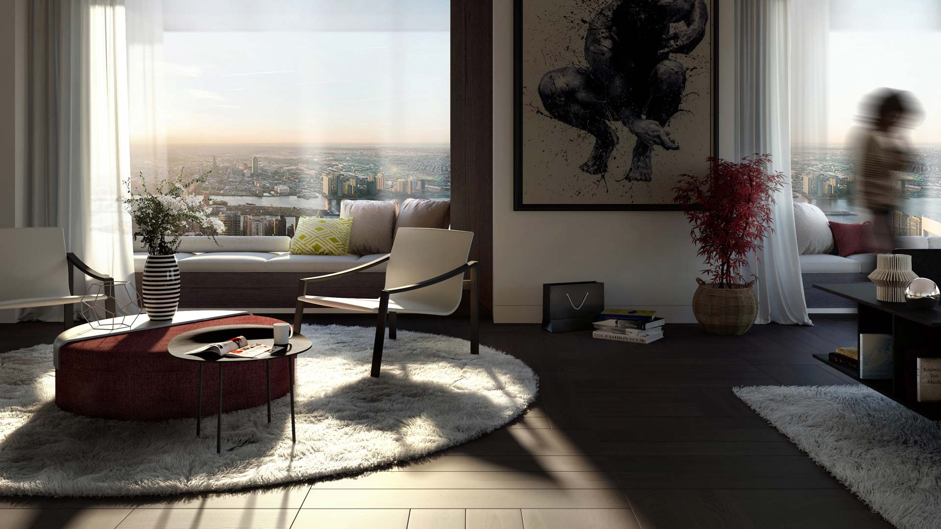
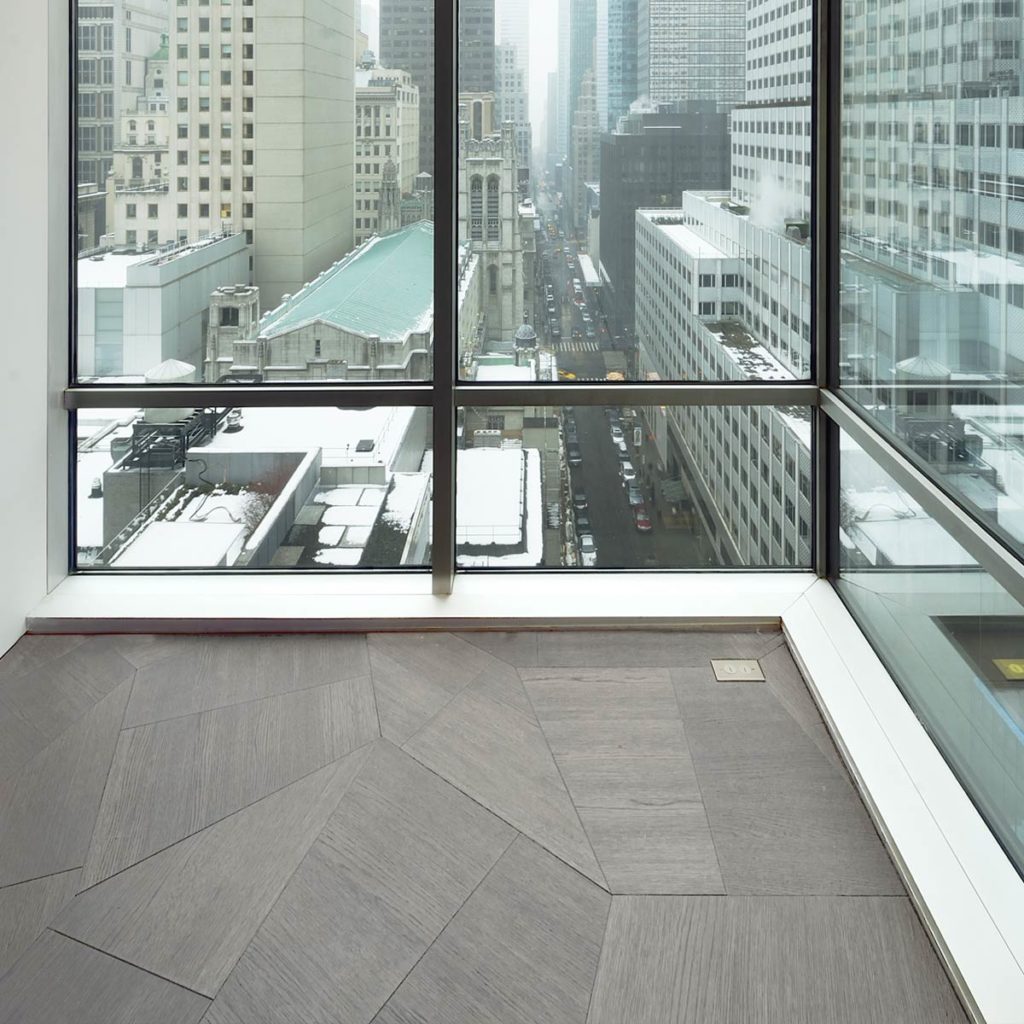
The tower was designed by Cesar Pelli and Associates. It is 52 floors high, with 6 levels for the museum and space for 240 top-class apartments. The high ceilings, full-height windows (including corner ones) and the width of the rooms allow light and air to flood into these apartments. Each side offers breathtaking views of the city skyline, with some windows enjoying the added bonus of overlooking the MoMA sculpture garden. The Museum Tower units are in great demand, not only because of the architectural quality, but also the high standard of service offered to tenants. The individual units were mainly conceived as small-scale apartments, with one or two bedrooms. In some cases, it was decided to merge them, creating large, comfortable and functional apartments.
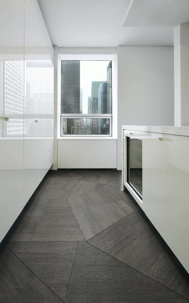
The recent refurbishment of an apartment in the Museum Tower by Asdrubal Franco and Andres Azpurua (Domoarchitecture + OnSite) focused on optimising the views in a unit with large, airy living areas on one side and a private bedroom area on the other.
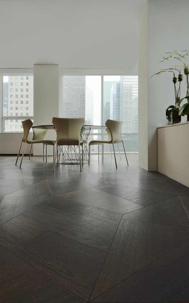
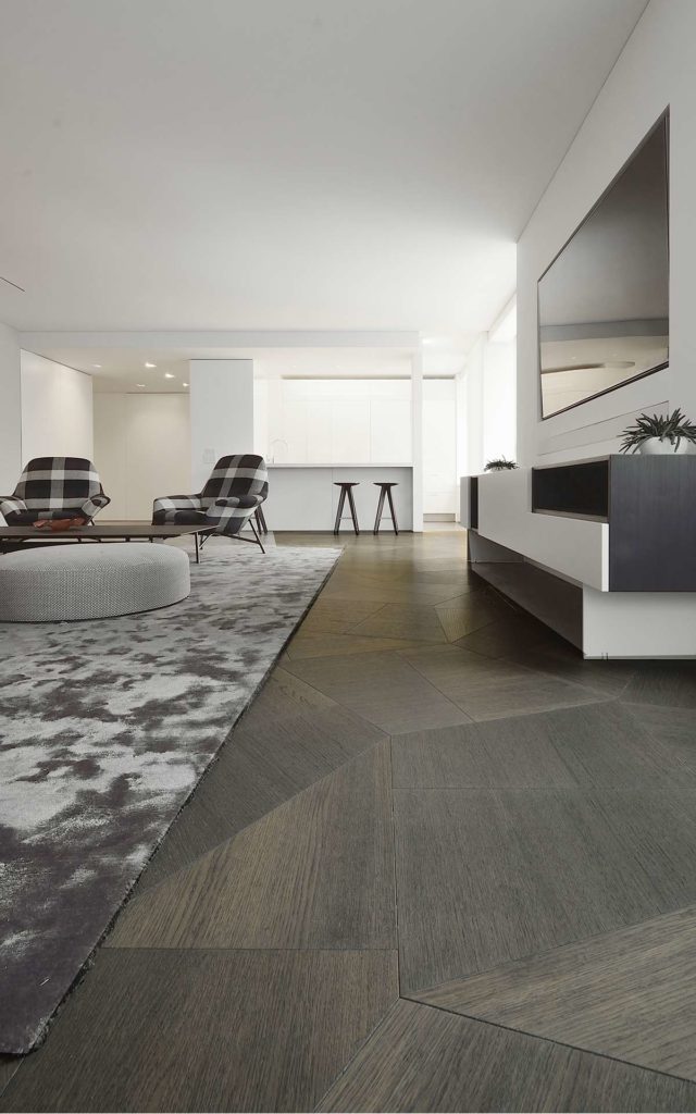
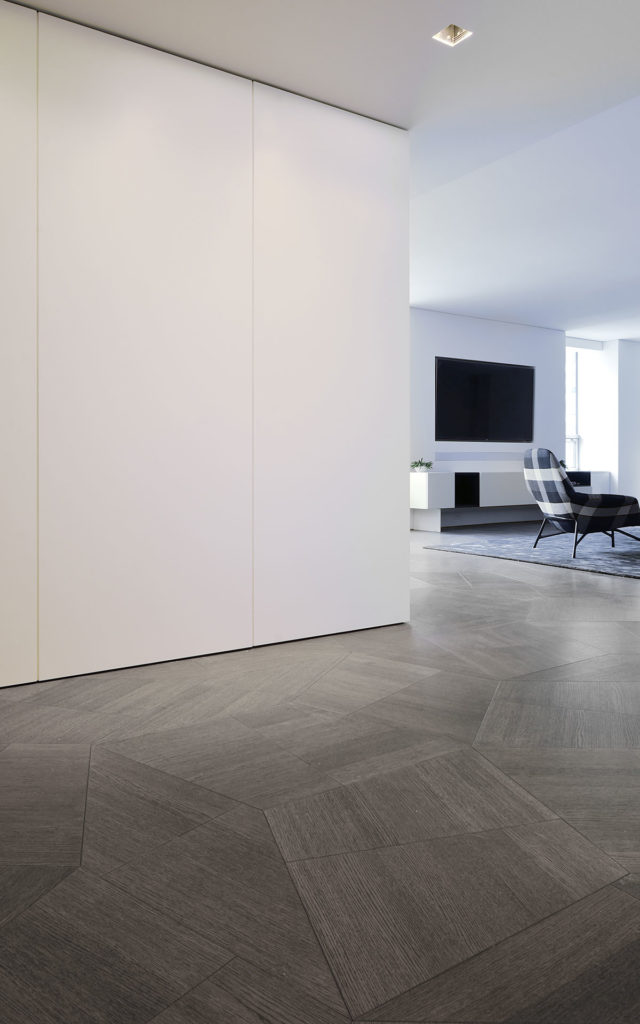
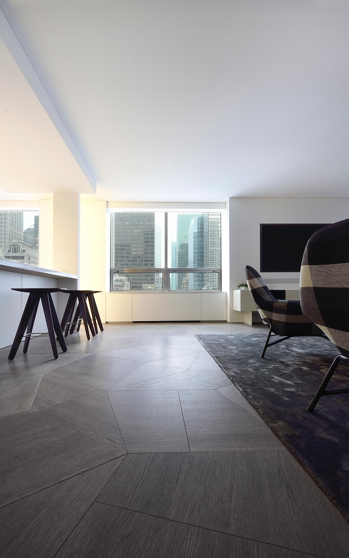
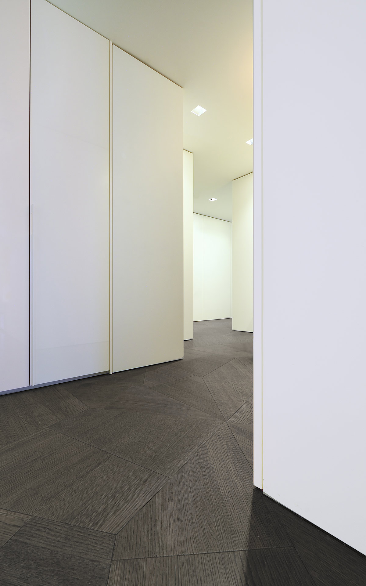
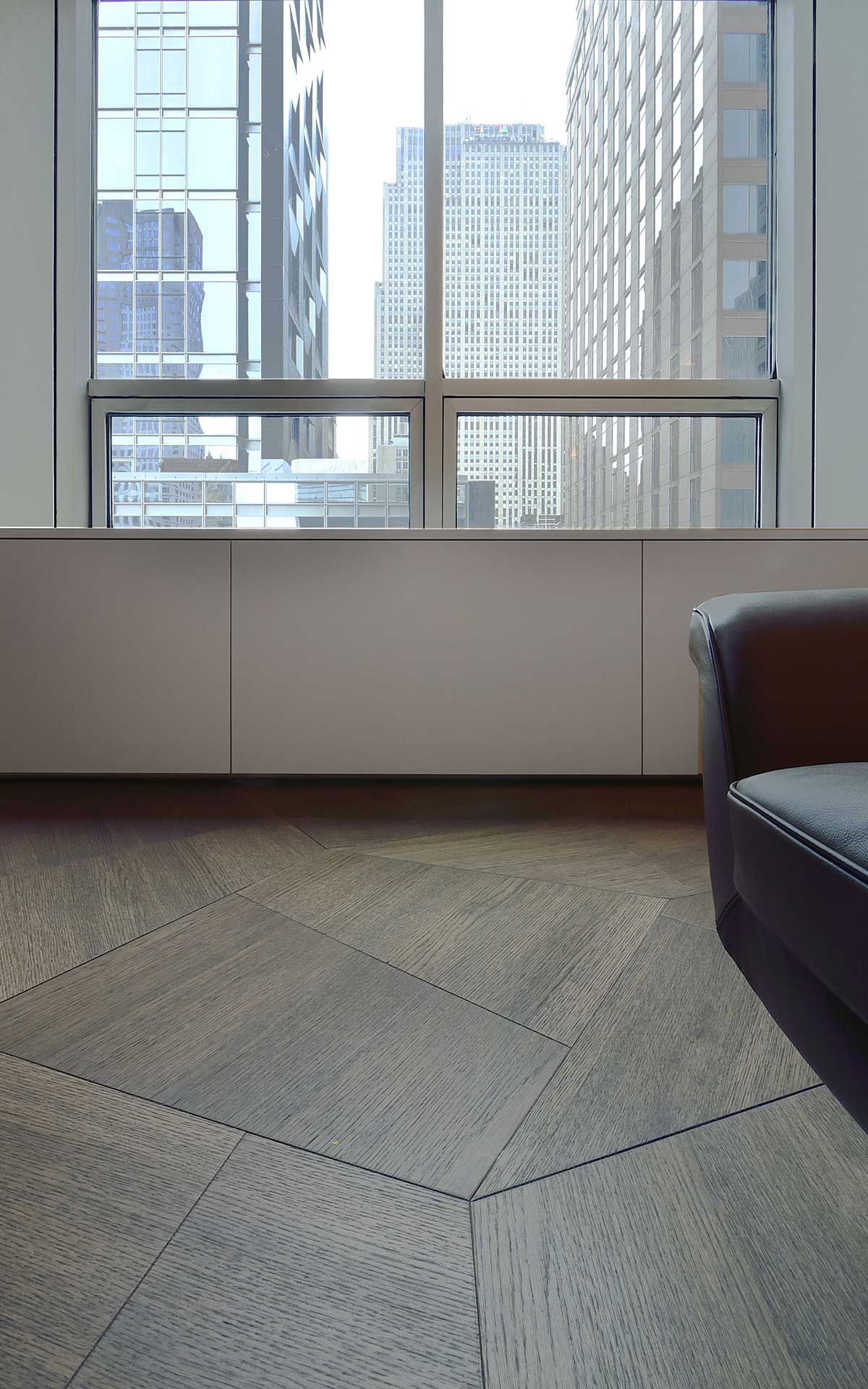
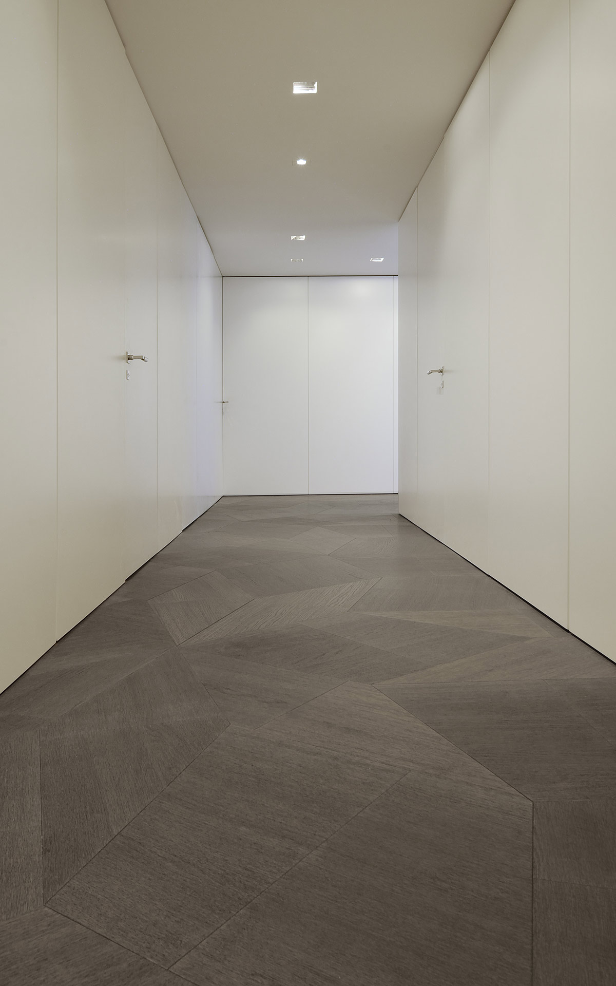
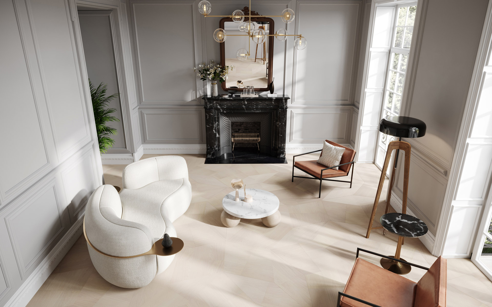
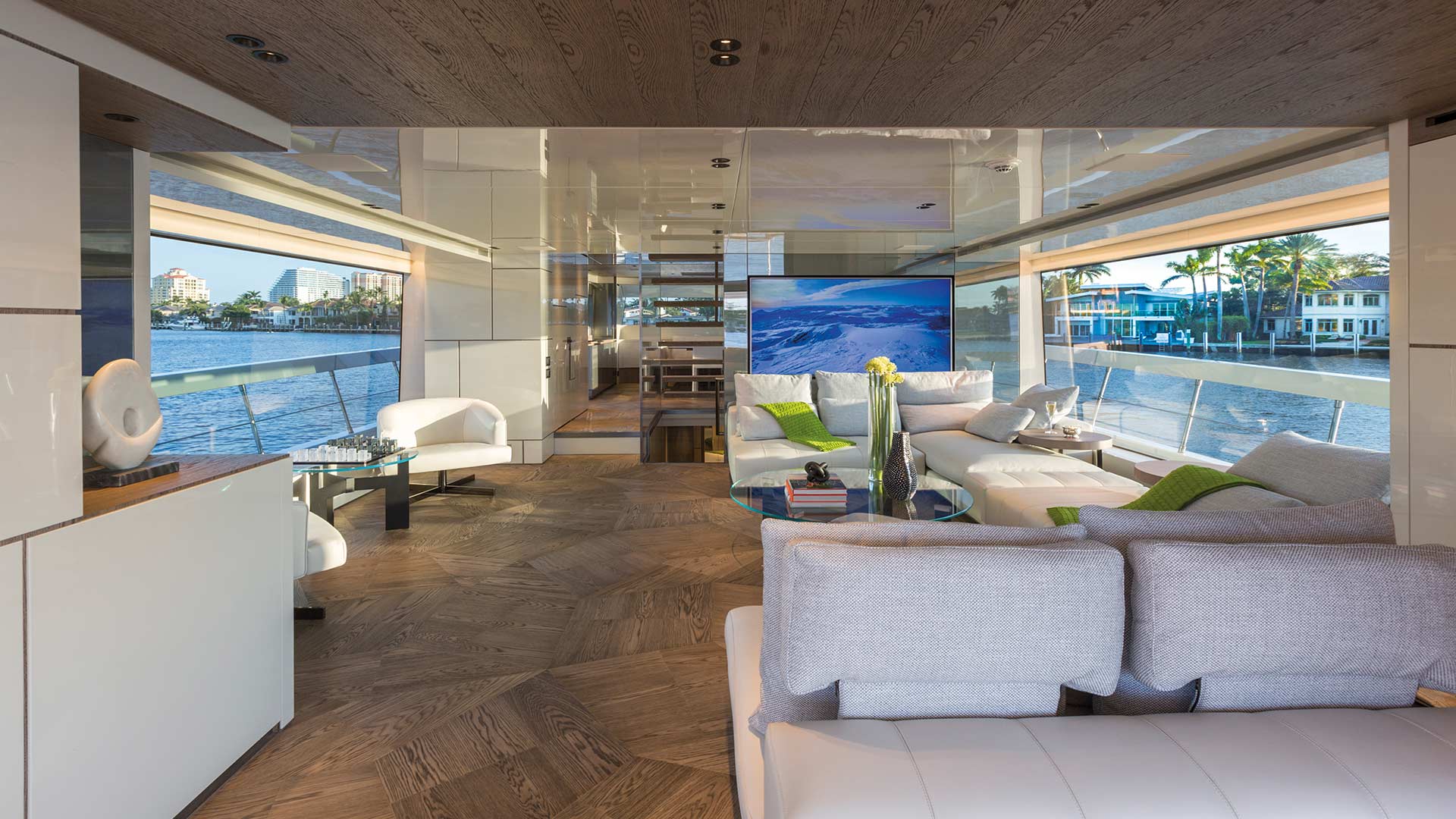
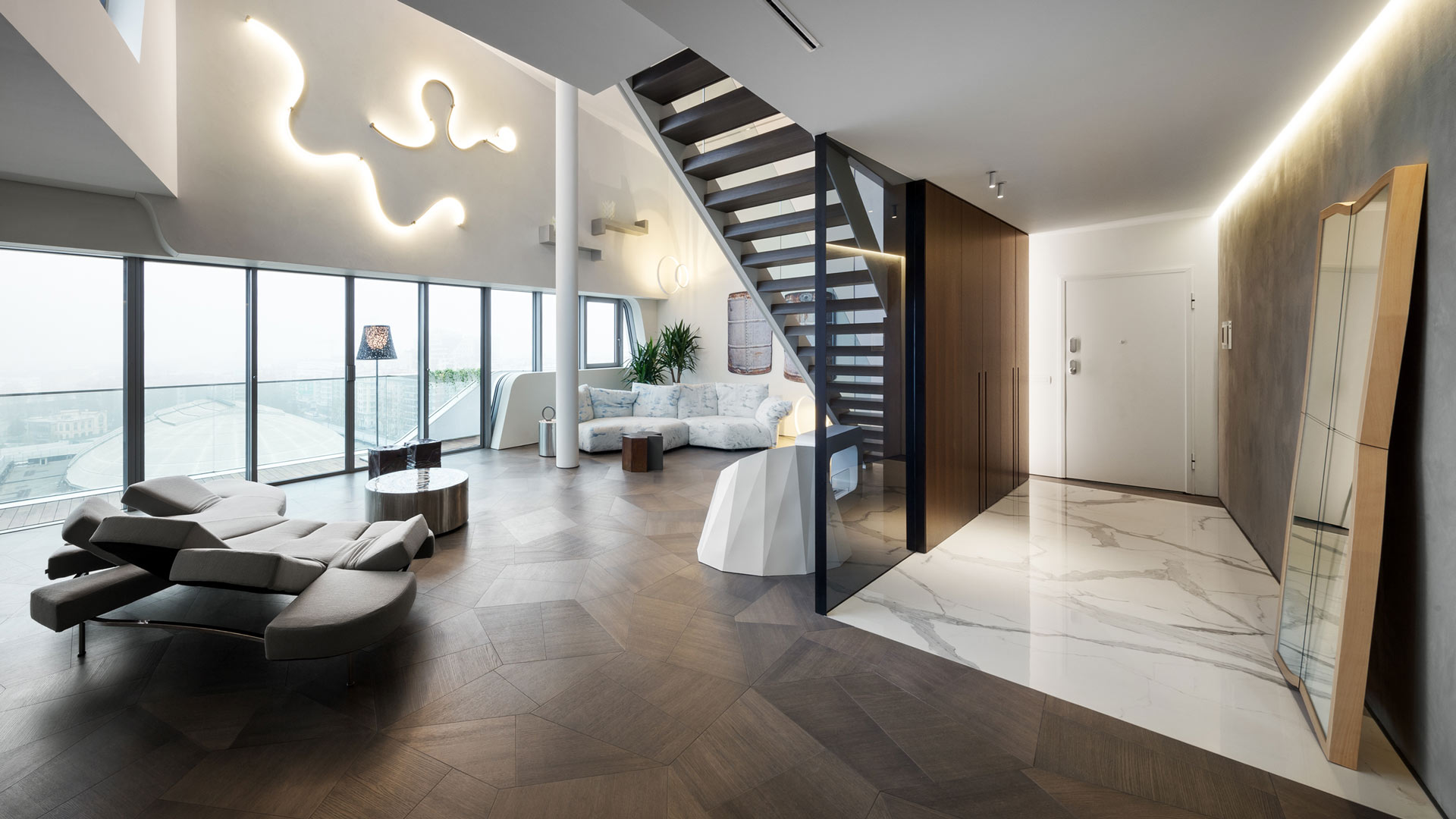
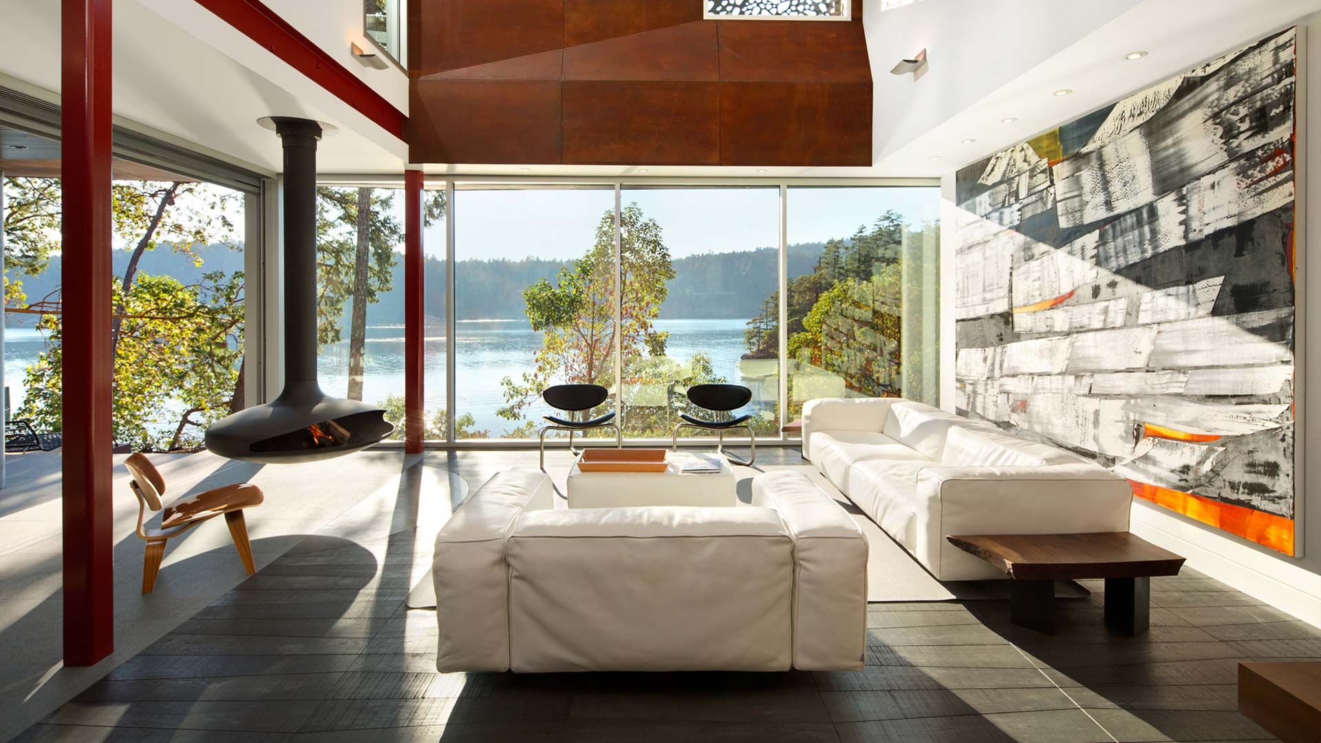
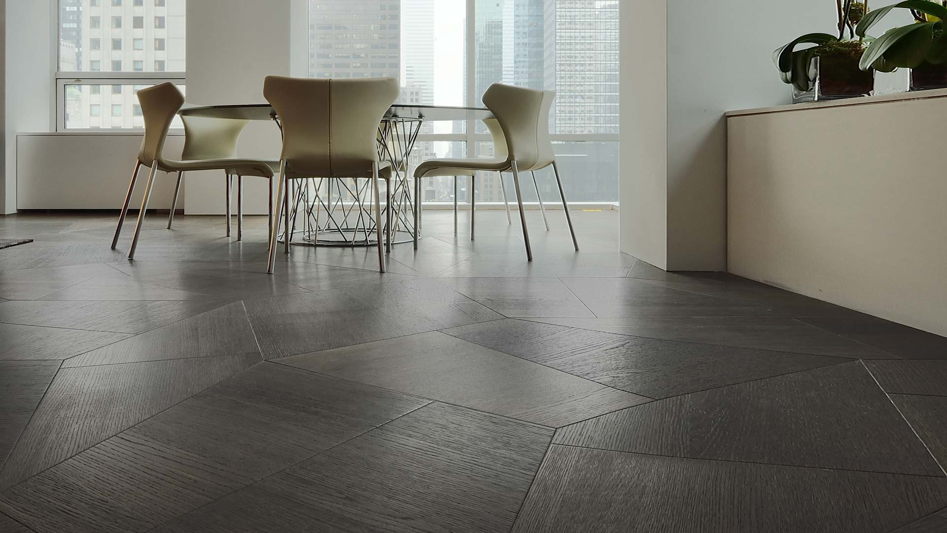
The dominant colour is white for the furniture, ceiling and walls, where the windows are framed like landscape paintings. The uniformity of colours creates a sense of seamless space, enhanced by the flooring being the same throughout the flat. The project designers chose wooden surfaces, by Daniele Lago for Listone Giordano, with a geometrical pattern inspired by the golden ratio. The three trapezoidal oak modules of the Slide collection can be juxtaposed in different ways to convey the overall impression of a random pattern, enriching the visual and formal impact and overturning the classic image of a wooden floor. The tone chosen contrasts with the prevailing white and the geometrical patterns of the floor create a dynamic play of lines, corners and colour nuances that further enhances the apartment and Cesar Pelli’s architecture.
